“Stocks for the Long Run” is the mantra of many investors today. The U.S. stock market’s stellar performance, especially post 2008, and its rarity of long-term losses have become something of a gospel. Renowned experts like Eugene Fama and Ken French support this belief, estimating high probability of substantial gains over extended horizons.1

Indeed, the U.S. stock market was the strongest performing market in the 20th century. As Stocks for the Long Run author Jeremy Siegel noted:

“… U.S. stocks have been the best long-term investment over the past century. For the entire period from 1926 to 1996, the average real return on U.S. common stocks has been about 7 percent, far higher than the real return on any other investment. This long-run performance is unique not only in U.S. experience but also in that of other developed and emerging markets. The U.S. stock market has outperformed all other equity markets in the 20th century.”2

As a result, a common asset allocation for investors today is to be heavily concentrated with 60% or more of their portfolio in stocks3 as stocks have historically had the highest return of the major asset classes, particularly in the United States.4

Source: Deutsche Bank. Past performance is not necessarily indicative of future results.

Investors often diversify across different stocks through index funds tracking indices such as the S&P 500 or MSCI World as well as through Target Date Funds which are often available in company sponsored retirement plans.

The U.S. stock market has indeed shown strong historical performance. Consistent with many expert recommendations, the distribution based solely on U.S. return data indicates a low (1.2%) probability of a loss in buying power over a 30-year horizon.5 However, it’s important to remember that the U.S. in the 20th century was the most economically successful country over that period.

A broader and longer examination6 of global stock market performance does not pain so rosy a picture, suggesting that stocks are not as reliable of a long term investment as many believe.

Looking at developed markets around the world from 1841 to 2019, we see a much higher probability of loss over a 30-year period at 12.1%.7

That means even at 30 year horizons across the world’s most developed markets, investors have historically had about a 1 in 8 chance of loss, only slightly better odds than playing Russian Roulette!

Domo Arigato Mr. Sequencing Risk

Following WWII, Japan seemed set to establish itself as an economic giant after tremendous economic growth over the decades leading up to the 1990s. At the end of 1989, Japan’s stock market was the largest globally in aggregate market capitalization.

Over the subsequent 30 years, diversified investment in Japanese stocks produced returns of -21% in real terms.8

Japan’s -21% real return realization over the past 30 years is not exceedingly rare. Several developed countries have realized worse performance or even complete stock market failure. This observation lies in the 9th percentile of the wealth distribution, meaning that there was almost a 1 in 10 chance of a comparable or worse outcome over a 30-year period.9

An investor who learns about the distribution of 30-year returns using only the U.S. experience would assign a probability of just 0.5% that a return as extreme as the Japanese return realization could occur. The abundance of similar examples suggests that the U.S. distribution is overly optimistic.

When we look at the history of a 60% stock/40% bond portfolio, we see a number of instances in developed countries where these portfolios struggled or collapsed completely.

Source: Dalio, Ray. A Changing World Order. Avid Reader Press / Simon & Schuster, 2021. Past performance is not necessarily indicative of future results.

How to Drown in a 2 Foot Deep River

One of the most interesting features of the long run and international data is the uncertainty over real investment outcomes faced by long-horizon investors.10

The average outcome is a 766% increase or a compound annual growth rate (CAGR) of 7.46%, very close to the commonly touted 7% CAGR you see in financial media. 

So, it is technically accurate to say a 7% CAGR is the average long-term return of an all equity portfolio, what matters to me as an individual investor is not the average return but the dispersion of possible returns for me.

For an investor with a 30 year timeline, the 1st percentile of real payoff is just $0.06 (a loss of -94%) , whereas the 99th percentile is $71.96 (more than 70x). That’s a big difference!11

These are both extreme outcomes so let’s consider a more likely set of possibilities: the 25th percentile profit on $1 invested is $1.82 and the 75th percentile profit is $9.00. 

This means that there was a 25% chance of only an 82% increase over a 30 year period: a 2.02% compounded annual growth rate (CAGR).

If I am starting with $500,000 at age 35 and watching it compound until retiring at age 65, getting the 25th percentile returns means retiring with $910,000.

Getting the “average” 7% means retiring with ~$3.8 million in assets. The lifestyle I could afford between those two is quite different.

Source: Anarkulova et al.. Stocks for the Long Run? Evidence from a Broad Sample of Developed Markets (January 18, 2021). Journal of Financial Economics (JFE). Excerpts from Table 4

So while it is true to say that the average expected return is ~7% per year over a 30 year time horizon, what matters to me – and I think to most investors – is not the theoretical average returns of the market but maximizing the likelihood of doing ‘good enough.’

Just as you can drown in a river that is just two feet deep, on average,12 you can run into serious financial problems investing based solely on an expected average return.

When I hear that an all equity portfolio has historically had a one in four chance of only a 2% annual compound growth rate, it makes me think a lot differently about an equity heavy portfolio than when I hear it has an average return of 7%.

The 20-year and 30-year probabilities of not just low returns, but a decline in wealth from stock market investments are also substantial. The loss probability is 15.5% at 20 years and 12.1% at 30 years.13

Is this time different?

One reasonable objection to these findings is that markets change over time. The nature of financial markets in the 1890s and 1990s was very different in terms of the number of listed securities, concentration of firms across industries, trading technology, availability of pricing and financial information on listed firms, trading regulations, and investor protections, among other factors.

International equity markets in the late nineteenth and early twentieth centuries were highly concentrated in railroad and mining-related firms.

To take this into account, researchers looked at the distribution of real payoffs for samples starting roughly 40 years apart from the original 1841 sample: 1880, 1920, 1960, and 2000.

Source: Anarkulova et al.. Stocks for the Long Run? Evidence from a Broad Sample of Developed Markets (January 18, 2021). Journal of Financial Economics (JFE). Excerpts from Table 7.

These alternative start dates show the original finding is robust. In all but the post-1960 sample, there is still a greater than 1 in 10 chance of having lost money at a 30 year horizon and the 1960 sample results are just barely breaking even.

The 25th percentile outcome for the 1960 sample is similar with the best scenario being a 125% return over 30 years (2.74% CAGR).

To us, these results pretty clearly contradict any advice that stocks are always safe investments if you can hold them for a long time. Even at long horizons in the world’s most developed markets, investors have born considerable risk of loss or well-below-average returns.

Muricah’

Another objection to this is that some inventors believe in the U.S. economy and that it will continue its period of excellent performance. Let’s call it the “Muricah’ Thesis” which embodied in the energy of the young gentleman you see below.

This may well be, but the challenge in getting superior investment returns is that it is not merely enough to be correct. You must be contrarian, but correct.

While the U.S. performance in the 20th century may seem obvious now, a reading of financial history suggests to us that it was impossible to know this ex ante. If you had asked inventors circa 1900 what country offered the most promising investment returns for the coming century, Germany or the UK would have been far more likely candidates than the U.S. Indeed, The U.S. performance may have been so strong over the 1930-2020 period precisely because it did not seem likely at the beginning of this period.

The U.S. equity market has had particularly strong performance in the 2009-2021 period that is fresh in investors’ memories. For that to repeat, it is not enough merely for the U.S. economy to be strong and U.S. companies to do well. They must deliver even better performance than what is currently priced in.

Saying that the U.S. equity market won’t do as well as it has done historically doesn’t require resorting to some extreme “America is dying” sort of thesis. The Japanese example seems pretty instructive. I spent some time in Japan in the 2010s and it’s pretty great. That doesn’t mean investing in Japanese equities has gone well. for people over the last thirty years.

What to do about it?

One lesson we take from this is that many investors, particularly those that have been investing primarily in US equities in the post 2008 period of exceptional performance, need to reset their expectations about what future performance of equities is likely to be and/or alter their allocation.

Using the 160 year developed world sample, an investor who is comfortable with no more than a 2% chance of losing money over a 30 year period, should allocate no more than 35% to stocks, much less than is found in most portfolios today.

The other lesson we take is that diversification outside of an equity focused portfolio such as an all stock portfolio or the commonly used 60/40 is prudent. While historical evidence from the U.S. market alone might suggest a relatively safe investment environment for those with long investment horizons, this data shows that the experience in other developed countries is more nuanced.

We believe that the inclusion of defensive strategies that can do well in periods where equities struggle such as trend following and long volatility can help to increase the odds of a ‘good enough’ performance and improve long-term compounding.

Footnotes

  1. Fama, Eugene F. and French, Kenneth R., Long-Horizon Returns (November 20, 2017). Chicago Booth Research Paper No. 17-17, Fama-Miller Working Paper, Available at SSRN: https://ssrn.com/abstract=2973516 or http://dx.doi.org/10.2139/ssrn.2973516
  2.  Siegel, Jeremy J. “The Long-term Returns on the Original S&P 500 Firms.” The Journal of Finance, vol. 53, no. 6, 1998, pp. 2105-2128. doi: 10.1111/0022-1082.00075.
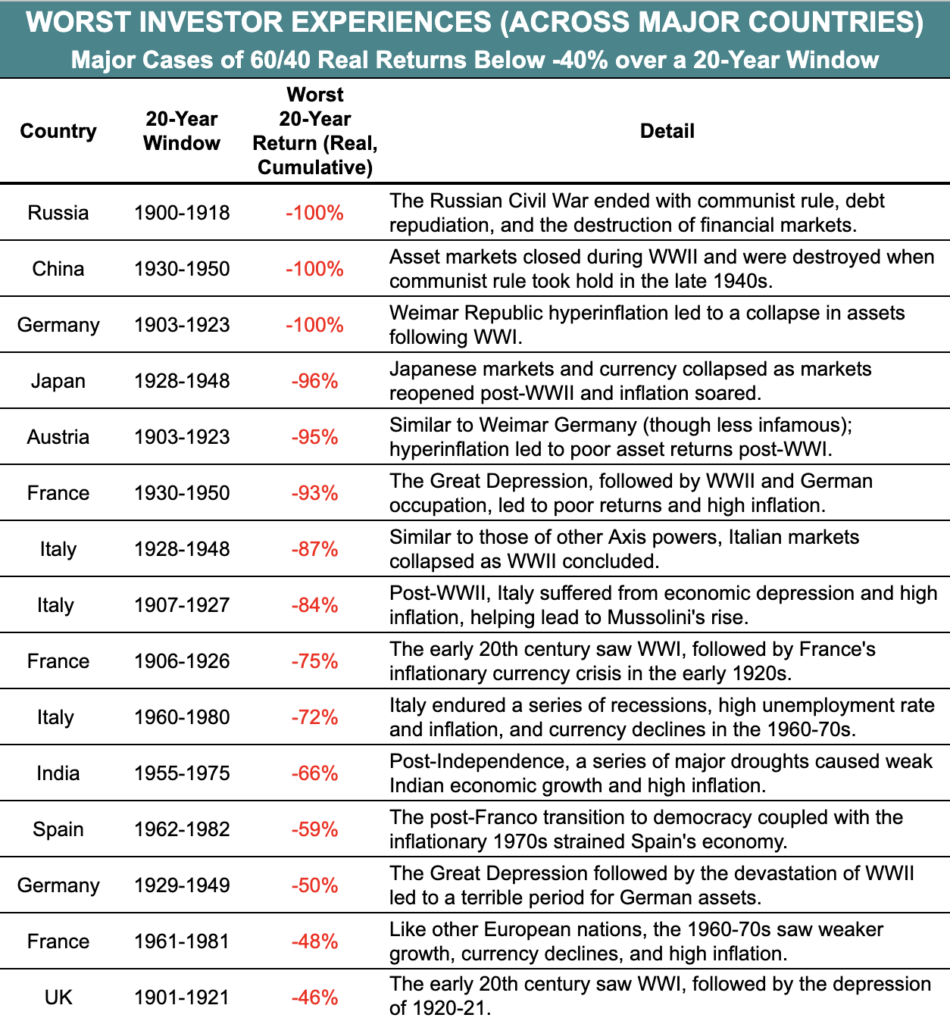
  3. We use 60% as a threshold for being heavily concentrated in stocks due to the historically higher volatility of stocks compared to other asset classes. A study from AQR found that even in a fairly conservative portfolio consisting of 55 percent stocks and 45 percent other assets, that 55 percent in stocks carries 87 percent of the portfolio’s risk. To give an overly simplistic example, if you have a portfolio with 60% in stocks and 40% in cash, the cash isn’t likely to go down by 20% in a year whereas this type of behavior is within the norm for stocks. Most other common asset classes (e.g. bonds, real estate) have historically had much lower volatility than stocks. That means most of the “risk” – that your portfolio’s value could fall – is in the stocks holdings.

    Generally the terms “risk” and “volatility” are used interchangeably in finance because the Capital Asset Pricing Model defines risk as the volatility of returns. The concept of “risk and return” is that riskier assets should have higher expected returns to compensate investors for the higher volatility and increased risk. Though I could write another paper on the many issues with equating volatility and risk, I will use the terms here identically as one can only fight so many battles at a time.
  4. Reid, Jim, Nick Burns, et al.. “The Age of Disorder.” Deutsche Bank Research, 8 Sept. 2020, www.epge.fr/wp-content/uploads/2020/09/The-age-of-disorder.pdf.
  5. Anarkulova, Aizhan and Cederburg, Scott and O’Doherty, Michael S., Stocks for the Long Run? Evidence from a Broad Sample of Developed Markets (January 18, 2021). Proceedings of Paris December 2020 Finance Meeting EUROFIDAI – ESSEC, Journal of Financial Economics (JFE), Forthcoming, http://dx.doi.org/10.2139/ssrn.3594660
  6. Dimson, Elroy, et al. “Stocks for the Long Run? Evidence from a Broad Sample of Developed Markets.” Journal of Portfolio Management, vol. 28, no. 2, 2002, pp. 110-120. doi: 10.3905/jpm.2002.319361.
  7. Ibid. The authors noted that there is a survivorship bias in that continuous stock return data from successful markets are more readily available. The sample used in the study achieves substantially greater coverage of developed country periods compared to previous studies to minimize this bias. Survivor bias can lead to an upward bias in performance relative to ex-ante expectations (Brown et al., 1995). To combat survivor bias, researchers used a classification of developed countries and treatment of return data that doesn’t condition on eventual market outcomes. Before 1948, countries entered the developed sample when their agricultural labor shares declined below 50%, drawing on evidence about labor patterns from the economics literature (e.g., Kuznets, 1973). After 1948, researchers used membership in the Organisation for Economic Co-operation and Development (OECD) and its European predecessor, the Organisation for European Economic Co-operation (OEEC). The treatment of return data in instances of market disruptions and failures (e.g., the temporary closure of stock exchanges or the permanent disappearance of the stock market in Czechoslovakia) reflects investor experiences to minimize survivor bias.
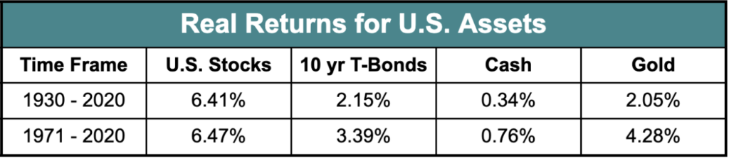
  8. Return numbers can be cited in nominal and real terms. The nominal rate of return is the percentage return you see on your investments before accounting for inflation. For example, if you invested $100 and earned $105 after a year, your nominal return would be 5% ($5 profit/$100 invested).

    However, inflation tends to gradually increase prices over time. So even though you earned 5% nominally, because of inflation, you may have slightly less buying power than when you first invested.

    The real rate of return adjusts for inflation by subtracting the inflation rate from the nominal return. So if inflation was 3% in the year you earned 5% nominally, your real return would be about 2% (5% nominal – 3% inflation = 2% real). (techincal aside: this is not quite correct. Since inflation & returns compound, the full formula is ((1+return)/(1+inflation))-1. The end result is pretty close to my naive calculation and I think you get the idea)

    This real rate of return reflects how much your buying power has actually increased after accounting for inflation. While the nominal return is the straight percentage gain, the real return better represents the growth in what your money can actually buy.

    TL;DR: the nominal return is just the simple percentage gain, while the real return adjusts for inflation to show how your purchasing power changed. I try to use real returns where available in this paper though it is not always feasible.

  9.  Anarkulova et al.
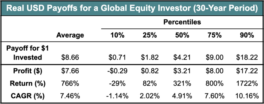
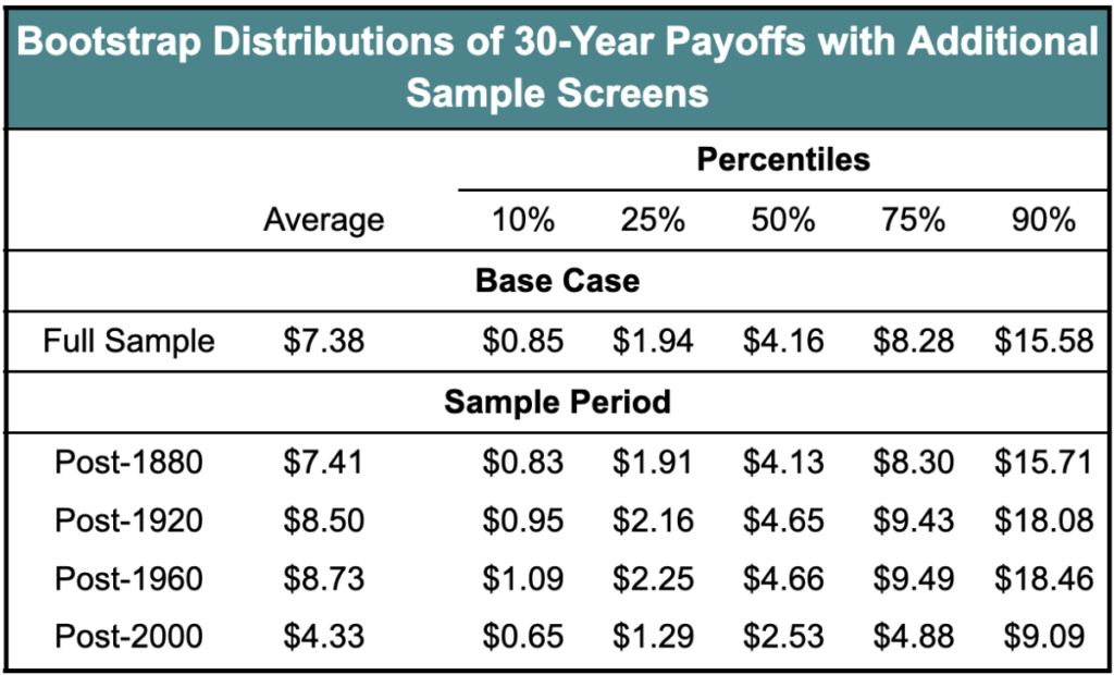
  10. The table summarizes the distribution of real payoffs from a $1.00 buy-and-hold investment across 1,000,000 bootstrap simulations at various return horizons. The underlying sample is the pooled sample of all developed countries. The real payoffs shown here are from the perspective of a global USD investor. Please see Anarkulova et al. for information on sources and calculations.

  11.  As a quick math refresher for the other liberal arts majors like myself in the back, the average return is the mean and is quite a bit higher than the 50th percentile because there are a few very good outcomes that make it higher. Percentiles are a way of ranking data points in a set from lowest to highest. They tell you what percentage of the data is below a certain value. For example, the 25th percentile means an investment return below which 25% of all returns fall. So in this example, the 25th percentile means 25% of simulations did worse and 75% did better. The 99th percentile means 99% of all simulations did worse and only 1% better. The 50th percentile is the median outcome.
  12. Consider a river which is 1 ft deep over 95% of its area, but contains a central channel that is 20 ft deep with a fast moving current. On average, it is ~2ft deep, but you can still drown in the main channel.
  13.  Anarkulova et al.