The year is 1945, and you are a 25-year-old World War II veteran looking to settle down and establish a family. Your parents lost everything in the Great Depression, including their home.
Despite a three-year rally, the stock market has yet to recover losses from the last 17 years. Friends and family were routinely tricked by short-lived rallies over the 1930s, only to see their investments decline yet again. You remember how the market lost over 50% in 1931 when you were in middle school. Then, just when it seemed to be recovering, lost over 30% in 1937 during your junior year of high school.1 Why would 1945 finally be a good time to invest in the stock market? No one you knew had done well by investing in stocks.
The Silent Generation (1925-1945) maintained this aversion to risk assets their entire lives.2 Those who succumbed to fear in the 1940s missed out on a once-in-a-generation secular boom in the 1950s with the Dow Jones rising 238.8% over the course of the decade.3
The year is 1981. U.S. Treasury Bonds purchased in 1977 lost almost half their value in inflation-adjusted terms by 1981.4 Double-digit inflation raged in a bear market that had started over a decade ago. Many economists believed this stagflationary period of both high inflation and low growth was an impossibility leaving many investors unprepared. How could this have happened?
Sitting on the couch with your next-door neighbor admiring Tom Selleck’s mustache on Magnum P.I., your neighbor brags about how they couldn’t beat the “low” 10% mortgage rate they had if they ever sold their home. A car commercial airs, advertising the new Ford Mustang with an auto-loan at a “low, low 19% APR.”
At this time, the investor heavily concentrated in bonds might have been laughed at. Yet, that is exactly what the most successful investors did. As interest rates fell continuously over the next 30 years, the value of their bonds increased dramatically.5
Times change. Human nature doesn’t. If past generations fared poorly by assuming that their direct experience represented a universal truth about how markets worked, why would it be any different for us? We believe that nearly all investors alive today suffer from the same recency bias as those investors that preceded us. To succeed as long-term investors, we believe that we must be aware of our biases and truly take a long-term view across many years, many geographies, and many possible futures.
When we think about investing, we think about the course of an entire lifetime. How might we build an investment portfolio that can stand the test of time? One of our sources of inspiration for how to do this is Harry Browne and his Permanent Portfolio.
Harry Browne and The Birth of the Permanent Portfolio
Browne’s research divided economic history into four possible macroeconomic regimes: Growth, Recession, Inflation, and Deflation. Browne believed that any period of recorded economic history in any country in the world could be fit into one (or a combination) of these four regimes.6

Browne’s historical perspective from the 1980s was different from ours today. He had lived through a period of low growth and high inflation that came to be known as stagflation – a combination of stagnant or slow economic growth and high inflation.
Stocks tend to do well in periods of higher-than-expected growth because companies are earning more money than expected which tends to cause share prices to rise.
Bonds tend to do well in periods of lower-than-expected inflation because their fixed-interest payments retain more purchasing power when the inflation rate is stable or declining. The lower inflation regime often leads to a decrease in interest rates, which can cause the price of existing bonds with higher yields to rise, providing capital gains to bondholders.
On the flip side, a stagflationary period of lower-than-expected growth and higher-than-expected inflation can be challenging for stock and bond-focused portfolios. The high inflation means the fixed interest payments from bonds can lag behind inflation and companies’ earnings are sluggish.7
Adjusting for inflation, the S&P Index peaked at 108.37 in 1968 and then fell 64% to 38.88 by 1982. The S&P didn’t return to its inflation-adjusted 1968 level for 24 years. Bonds did poorly too over the 1970s, which had repeated bouts of high inflation. The real returns of $1,000 invested in a classic 60/40 stock/bond portfolio in 1968 were nearly zero for two decades – finishing 1987 at $1,034.


In some ways, this period would be more challenging than anything most investors alive today have lived through. The 2008 GFC and COVID recessions were sharp but relatively short-lived. After bottoming in 2009, the S&P 500 made new all-time highs in 2012 (nominal) and 2013 (real). The COVID recovery was even quicker with the March 2020 lows being fully recovered by the end of the year.
Imagine yourself 20 years older than you are today and what your life will be like. If you have kids, how old will your kids be? What will your career look like? What will your financial needs be? Now imagine that you have less savings than you do today.
What does that imply about your life at that point? Are you able to retire? Pay for your kid’s schooling? Give money to the people or causes that you care about?
Browne lived through a period like this and it led him to recognize the need for assets that could perform well in periods of low growth or high inflation periods to help make up for where stock and bond-focused portfolios struggled.
Looking at the tools he had available at the time, he came up with a simple and elegant portfolio:
- 25% in Stocks which should do well in Growth
- 25% in Bonds which should do well in Deflation
- 25% in Cash which should do well in a Recession
- 25% in Gold which should do well in Inflation
By directly including assets that should do well in decline and inflation periods like the stagflationary period the U.S. lived through, we believe Browne made a large improvement to the traditional 60% stock/40% bond portfolio. He called his alternative the Permanent Portfolio. Permanent, because it was designed to handle each of these macroeconomic regimes regardless of which showed up.

Like the GI coming home after WWII that was afraid to invest in stocks right before a major bull market, many investors seem to anchor to recent history and expect that their experience is indicative.
However, the most recent ten or fifteen-year period is usually not representative of the range of possibilities over an investing lifetime.
Over the 54-year period from 1969 to 2023, about one investing lifetime, we calculated growth and inflation regimes and combined them to create four combined regimes:8
- Growth Up & Inflation Down
- Growth Up & Inflation Up
- Growth Down & Inflation Down
- Growth Down & Inflation Up
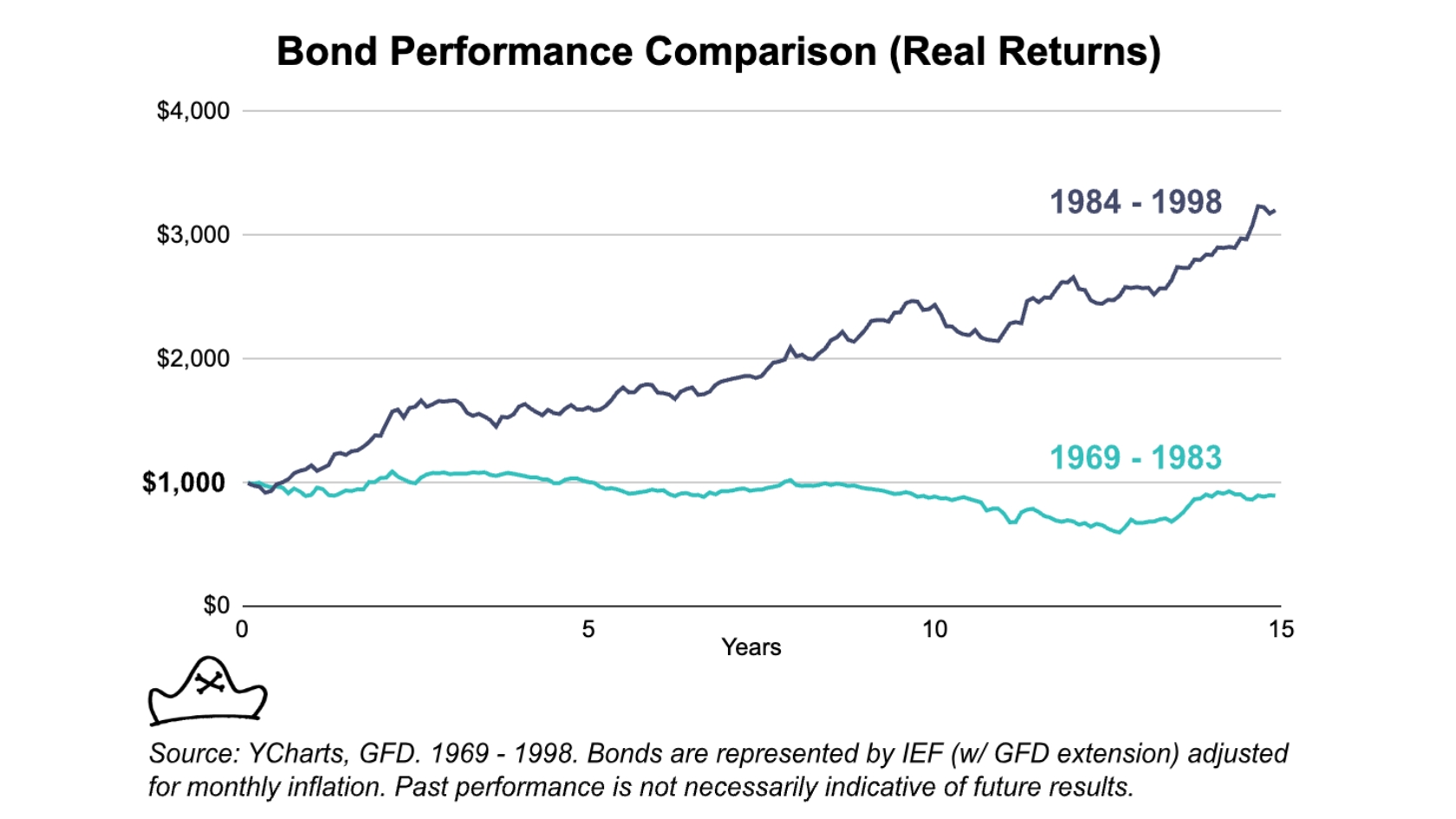
What we see is that one sub-period can look very different from what happened in another sub-period. Comparing the total period of 1969-2023 with two 14-year sub-periods (1969-1983 and 2010 to 2023), we see a different mix of regimes.

2010 to 2023 was a period of low inflation with over 60% of the period being categorized as low inflation. From 1969 to 1983, only about 25% of the period was marked with low inflation, leaving almost 75% as having higher inflation.
We believe one of the most common mistakes investors make is to over-optimize their portfolios for the recent regime.
The high inflation of 1969 to 1983 led to pretty lousy performance by bonds. The investors in 1982 that referred to bonds as ‘certificates of confiscation’ were not unjustified in their feelings given bonds’ pretty lousy performance.
However, if they decided to remove bonds out of their portfolio, they likely regretted it. The next 40 years saw much lower inflation and better performance by bonds.
With apologies to Kurt Vonnegut, “[Financial] history is merely a list of surprises. […] It can only prepare us to be surprised yet again. Please write that down.”
Optimizing your portfolio for the recent past in 1983 meant you were not in the best position going forward. We have every reason to believe that the same is true today.
One solution is to be able to predict changes in macroeconomic regimes going forward. I suspect that there is nothing I can say here that will convince someone who truly believes that they can predict the macroeconomy that they are wrong though I will try.
In his 2011 book, Expected Returns, AQR’s Antti Ilmanen outlined his views on the next 20 years that “seem[ed] close to the consensus” at the time:
First, I see only moderate returns from risky assets over the medium term. Growth prospects are not promising, given the pendulum shift against free markets and the still stretched private and public balance sheets. Starting yields are historically low. Risky asset valuations are unlikely to improve on a sustained basis, thanks to wealth-dependent risk aversion and lingering memories of the crisis, higher macroeconomic volatility, less trust all around, and less benign inflation prospects for risky assets.
He went on to suggest that if any risky assets did well, it was likely to be international stocks rather than U.S. stocks.
On the date of the book’s publication, Mar 14, 2011, the S&P 500 was at 1296.39. As of the end of 2023, 12 years into the forecast it was at 4769.83, a 267.93% gain.9 This 13.5% CAGR is in the top 10% percent of outcomes based on long-run return data.10
This is not to throw shade on the prediction. Indeed, it was a thoughtful and reasonable prediction submitted with a great deal of epistemic humility and based on thoroughly researched historical data made by a professional investor who had spent decades doing research on that data with all the tools of one of the most well-regarded quantitative investment firms in the world.
To give a more recent example, I don’t know anyone that had “global pandemic leads to global stock market crash followed by enormous tech bull market and real estate boom” on their 2020 forecast.
I will also note that most, if not all, investors who I have seen get famous for making a big macroeconomic prediction have failed to follow up on it. Most of the investors made famous in Michael Lewis’s The Big Short had poor performance in the subsequent ten years to give only one example.11
For us, the complexity of the global economy and follow on effects are simply unpredictable and attempts to definitively forecast them are likely to do more harm than good.12
The Permanent Portfolio approach resonates with us because it doesn’t try to predict the future. It tries to be prepared by including assets designed to perform in each of these macroeconomic regimes. We came to believe the Permanent Portfolio approach was an important step in the right direction from stock and bond-focused portfolios toward our objective of maximizing long-term wealth while letting us be confident that we and our families will have the financial resources to deal with what life throws at us.
The real magic though is not in just how the individual asset selection covers different regimes, but how the combination of assets, the overall portfolio construction, works.
Let’s take the three principal components of the Permanent Portfolio: Stocks, Bonds, and Gold. Over the period from 1973 to 2022, stocks and bonds were the best-returning assets and gold was the worst.13


Based on this, you might think that “I want to get the best long-term performance so I should invest in bonds and maybe some stocks.”
Well, what happens if we combine all three into an equally weighted portfolio and rebalance it monthly?


The combination of the three does something pretty cool. It performs better than the best-performing individual asset – stocks. At the same time, its maximum drawdown is similar to its least risky and volatile asset – bonds.
Stocks and bonds have the higher returns over this period. Gold has the lowest return and highest drawdown of the three assets so it would seem like adding it would decrease the overall performance. However, it actually increased it!
The whole Permanent Portfolio is greater than merely the sum of its parts. Adding a lower-returning asset – gold – increased the overall portfolio performance.
Gold was mostly uncorrelated with stocks and bonds over this period, meaning it performed well in periods where they did not – most notably in the late 1970s and late 2000s. So even though its overall returns were lower, it delivered those returns at a great time. Rebalancing the gains in gold into stocks and bonds in the late 1970s turned out to be a great trade. Stocks and bonds delivered strong performance in the 1980s and 1990s.
Because gold’s path was complementary – it performed well in a couple of periods where one or both of the other assets struggled – it improved the portfolio meaningfully.
This is the key lesson we take from the permanent portfolio: Adding a lower-returning asset with a complementary (AKA uncorrelated) path can improve the overall portfolio.
The inclusion of cash14 in the portfolio as Browne originally proposed reduces the return (6.18%) but also reduces the volatility (6.95%) and max drawdown (-15.09%).


On a risk-adjusted basis, the portfolio with cash is the best performer as it has a lower return but even lower volatility and drawdowns.15
An investor looking to achieve higher returns could take the combined portfolio of stocks, bonds and gold and increase the leverage to match that of stocks over that period, yielding a higher return for the same amount of volatility.


This is a pretty big difference! With the same amount of volatility as an all-stock portfolio, the Permanent Portfolio achieved a 208% greater return. If you started with $100,000 then the difference after 50 years would be ending up with $4.68mm vs. $2.3mm.
By taking assets that do well in different macro regimes and rebalancing between them, our combined portfolio can create stability through volatility: a smoother return path for the portfolio as a whole, even though the individual elements may be more volatile.
Research from Meb Faber shows the challenge of investing in just one asset class if you are trying to build a safe portfolio.
Even cash had a -48% drawdown in the period studied! Counterintuitively, a portfolio of ‘more risky’ assets can actually have a lower drawdown than just holding what seems like a very ‘safe’ asset.

That’s why we believe building a portfolio doesn’t just mean finding the one asset that has the most favorable characteristics. It means finding the right combination of assets that can be combined to create a more robust portfolio.
This is what we would expect true diversification to look like. Over a 50-year period which included periods of growth, recession, inflation, and some deflation, the Permanent Portfolio has chugged along, providing solid returns with manageable levels of risk.
Footnotes
- Source: YCharts. Dow Jones Industrial Average (^DJI)
- Lehman, Nathaniel, and Sissy Osteen. “A Financial Professional’s Guide to Generational Risk Analysis in Stock Market Investing.” Journal of Consumer Education, vol. 29, 2012, pp. 60–69, www.cefe.illinois.edu/JCE/archives/2012_vol_29/2012_vol_29_pg60-69_Lehman_and_Osteen.pdf. Accessed 16 Aug. 2023.
- Source: YCharts. Dow Jones Industrial Average (^DJI)
- Source: ReSolve Asset Management - IEF with GFD extension. YCharts - 30-year U.S. Treasury Rate (I:30YTR).
- Ibid. When interest rates fall, bond prices increase. For example, if you bought a bond with a face value of $100 and a 10% interest rate today then it would pay you $10 per year. Let’s say that tomorrow the interest rate available is 5%.In order to get the same $10 per year, you would need to buy a bond with a face value of $200. As a result that 10% interest rate bond is now worth $200 because it pays more interest than what is available today. So, it is generally the case that as interest rates fell - as they did from the 1980s to 2010s - bond prices rose.
- A similar model was proposed by Ray Dalio around the same time. I suspect the end of the gold standard in 1971 and Stagflationary period that followed was a wake up call for many that led to a multiple discovery situation. We first learned about it from Harry Browne.
- I use terms here like “lower than expected inflation” and “higher than expected growth” to reflect the fact that asset prices tend to change based on performance relative to expectations. For example, if a company is expected to grow 10% every year and only grows 5% every year, most stock valuation models would predict that its stock price will decrease because the future earnings will be lower than what was previously expected.
In the same ways, if you expect inflation to be 1% and your bond is paying 5% then you are expecting a ~4% real return. If inflation turns out to be 2%, the value of the bond is likely to decrease even though we might not consider 2% a ‘high inflation regime.’
For simplicity's sake, I will refer to the four economic regimes as growth, inflation, deflation, and decline rather than the more accurate but tedious “higher/lower than expected…” I am just clarifying here that those terms are always intended in a way that is relative to expectations. As we looked at in Stocks for the Long Run - it’s possible for the U.S. economy to do well and US companies to do well but for US stock performance to be poor if growth is positive but not as strong as what is priced in at the time of investing.
- Following the methodology of Ilmanen, Maloney, and Ross in their paper cited here, these are normalized so that each of these combined regimes occurs approximately 25% of the time from the period from Dec. 1969 to May 2023 in the U.S. See Appendix B for methodology. Ilmanen, Antti & Maloney, Thomas & Ross, Adrienne. (2014). Exploring Macroeconomic Sensitivities: How Investments Respond to Different Economic Environments. The Journal of Portfolio Management. 40. 87-99. 10.3905/jpm.2014.40.3.087. Thank you to Corey Hoffstein for surfacing this paper for us and providing feedback on the calculations.
- Calculations performed using nominal SPX returns.
- Anarkulova et al.. Stocks for the Long Run? Evidence from a Broad Sample of Developed Markets (January 18, 2021). Journal of Financial Economics (JFE). Excerpts from Table 4.
- “John Paulson and Kyle Bass suffered a series of losses and client defections. Both
Paulson and Bass seem to have been swept up with looking for other bubbles. Bass has
predicted collapses everywhere from Japan to Europe to Hong Kong that have not yet
materialized. Paulson has lost money on a variety of positions over the years and recently
converted his firm into a family office.” Brown, Aaron and Dewey, Richard, Toil and Trouble, Don't Get Burned Shorting Bubbles (February 9, 2021). Available at SSRN: https://ssrn.com/abstract=3782759 or http://dx.doi.org/10.2139/ssrn.3782759 - There are a number of much more reasonable approaches to market timing which maintain broad diversification but use modest tilts towards one asset class or another based on certain valuation metrics or other indicators. Though we remain somewhat dubious of these approaches, we are open to them and they are certainly more reasonable in our view than the “put all your assets in the S&P 500” approach.
- We selected this period because it was the longest period for which we are able to get what we considered reliable data. Of course, it would be interesting to see a longer period but given that this is intended merely as an instructive example of investing over one lifetime, a ~49 year period seems like a suitable one.
- In a lot of financial literature, the word “cash” often refers to short-term treasury bills, most commonly 90 day t-bills. This is confusing because you will sometimes read research papers about how “cash outperformed in the inflationary 1970s” and this is largely because the short term interest rates were relatively high in that period which helped offset some of the inflation costs. For example, if the 90-day t-bill rate is 11% and inflation is running at 10% then the real return on t-bills is 1% even though actual ‘cash’ like the dollar bill in your pocket would have a real return of -10%. I will use the same convention with the word cash referring to short term t-bills.
- As a way to easily compare investment strategies, it’s customary to use the risk-adjusted return of a strategy: How much return are you getting per unit of risk? The idea is that if you have a strategy with a good risk-adjusted return then you can apply leverage to get more return if desired and that this is preferable to simply allocating to a higher return but even higher risk strategy. In my opinion, this is sound reasoning.
Typically the Compound growth (CAGR) of the strategy is used as a metric of return and the volatility of the strategy is used as a measure of risk. So your CAGR/Volatility = Risk-adjusted return. This is called a Sharpe Ratio after its creator William Sharpe. In this case, the Sharpe Ratio of the combined portfolio of stocks, bonds and gold is 0.76 while the Sharpe Ratio of Stocks alone is 0.43.
I could write an entire separate paper on the ways in which historical volatility is not always the best way to evaluate the risk and that there are a number of types of strategies which are very low volatility most of the time but occasionally huge losses (Mortgage Backed Securities and Long Term Capital Management to name but two examples). We often use alternatives such as Ulcer, Sortino, and MAR which define risk differently. However, I think it’s generally a reasonable thing to say that assets which go up fast can also go down fast (Exhibit A: bitcoin) so using their historical volatility as a measure of risk is a reasonable first order approximation and it’s an industry-standard term so I won’t try to reinvent the wheel here.
